I've grown into a designer who builds
systems that earn trust at enterprise scale.
In building Eranova AI, I learned to interrogate the brief before designing around it, to find the cause underneath the symptoms rather than paint over them. Working directly with a CEO and a senior developer sharpened my ability to hold design direction without losing technical precision.
The brief said:
make it look enterprise.
A redesigned website, a brand asset library, and a tested content framework. Built on one foundation.
A platform where design decisions
are sales decisions.
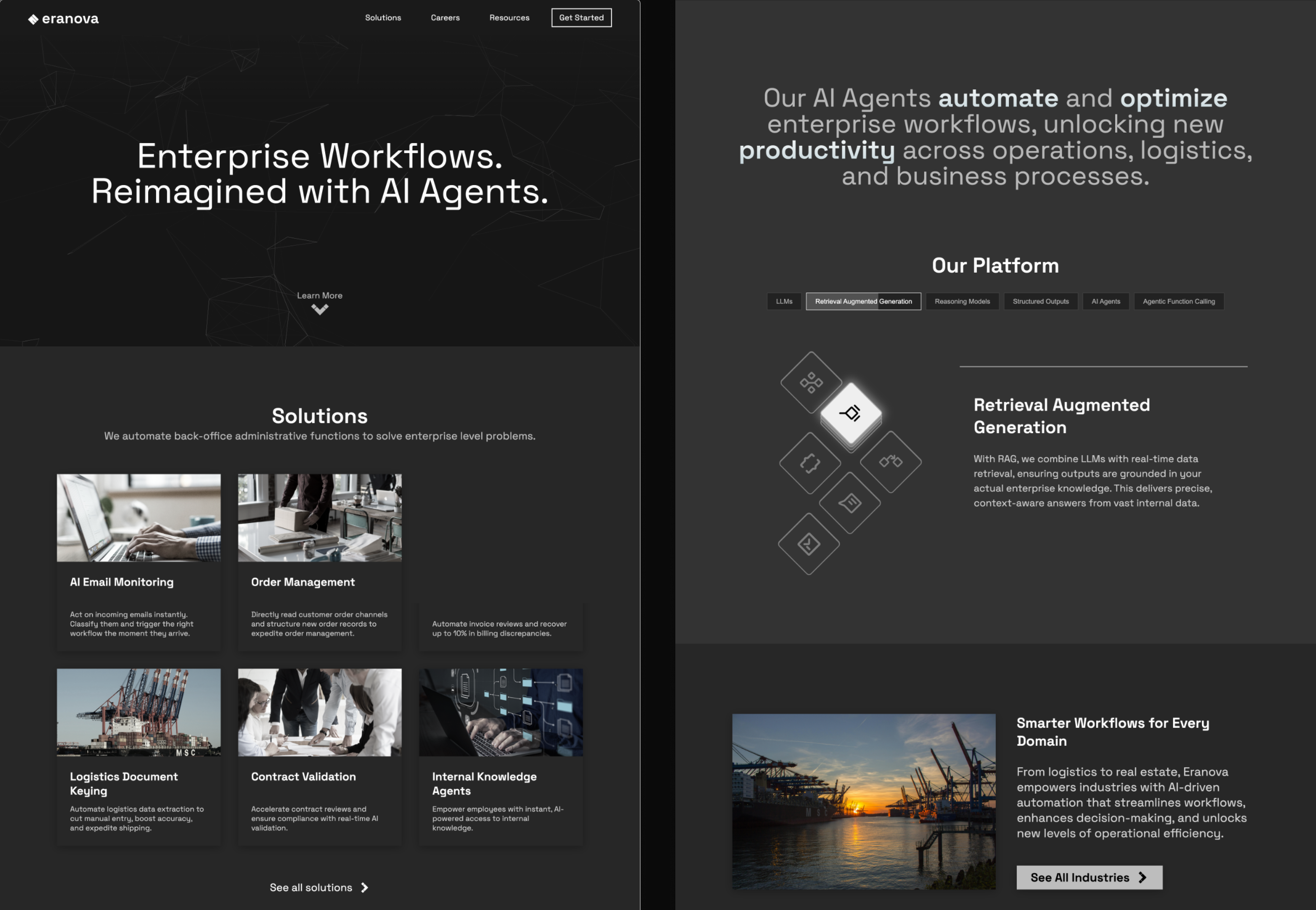
Eranova AI is an enterprise AI platform built for decision-makers: the CTOs, heads of data, and operations leaders deciding whether to trust a young company with critical infrastructure. For that audience the marketing site is not decoration. It is the first proof of competence.
The site had a problem most startups would want: unexpected traction. Real enterprise clients were landing, but the site didn't look the part. The brand felt generic, the UX was broken in ways nobody had documented, and there was no design system underneath any of it.
The brief was clear. Make it feel enterprise. Build something that closes deals before a sales call happens.
Five moments.
One redesign.
Click each step to follow how the engagement moved from a vague brief to a system-first commitment, and what shipped.
The brief asked for a look. The cause was three layers down.
The engagement opened with a visual brief. Make the website look enterprise. Month one's work would be a redesign that earned trust from the buyers landing on the site. One layer down, a different concern was already in motion: traffic was flat, the social presence wasn't converting, the marketing channel wasn't producing inquiries. One layer further down was the actual cause. The site, the brand, and the content weren't broken individually. They were operating without a system underneath them. Fixing any single layer on the surface would re-decay inside a quarter.
A visual brief
"Make the website look enterprise." A redesign request, rooted in how the company was being perceived by buyers landing on the site. Month one's deliverable.
Three layers, no system underneath
Below the visual ask sat a marketing concern (traffic, conversion). Below the marketing concern sat a system problem: site, brand, and content operating without shared infrastructure. Surface fixes on any one layer would decay inside a quarter.
- Q1Is "looking enterprise" caused by the visual treatment, or by something the visual treatment is sitting on?
- Q2If three layers share the same root cause, what's the right rebuild sequence to hold delivery inside three months?
- Q3How do we align on a scope wider than the original brief, backed by evidence the team can verify firsthand?
Audit the assumption before designing around it.
Before opening Figma, I ran a systematic evaluation of the existing site using Nielsen's 10 Usability Heuristics, an established industry framework, and documented every failure with severity ratings. The result became a CEO presentation: not a design pitch, but evidence for what was actually causing the symptoms in the original brief. The audit wasn't research alongside the work. It was the work that earned the engagement its real scope.
Not a marketing problem. A system problem.
The symptoms in the original brief, low traffic and low conversion, were accurate readings of a real issue. But they weren't the cause. They were what happens when three layers operate without infrastructure underneath. A facelift on any single layer would decay back into the same state inside a quarter. The deliverable wasn't the surface. It was the system underneath, with each layer rebuilt on top of it.
A marketing question. Why aren't the posts converting? Maybe the landing page needs work.
A systems question. Site, brand, and content were all symptomatic of the same missing infrastructure.
Rebuild three layers together, on one system underneath.
I committed to a token-based design system and one master template before designing any final UI, and to rebuilding all three layers (site, brand, content) in parallel. Addressing one in isolation was the pattern that produced the symptoms in the first place. The visual direction followed from the system constraints, not the other way around.
Fix the layer the brief named
Redesign the landing page. Sharpen the posts. The smallest scope, the fastest delivery, the closest match to the original ask. But the symptoms would return inside a quarter because the underlying system stays missing.
Rebuild three layers on one system
A design system underneath. Site, brand, and content each rebuilt on top of it. The cost is upfront discipline and a scope conversation. The saving is durability: no layer decays without the others holding it up.
Three months. Three layers. One system underneath them.
The redesign shipped on schedule. Site, brand asset library, and content framework all sit on the same token system, so every future page, post, and asset inherits the same standard without re-deciding. The original marketing question got its answer, as one outcome of a system rebuilt, not as a content fix in isolation.
Redesigned marketing presence
Dark-mode unified across every page, with enterprise-grade hierarchy, CTAs above the fold, and consistent component behavior end-to-end.
16 tokens + master template
Variables for icons, surfaces, and borders aliased to a foundation layer. One master layout scales across every solution page without re-deciding.
Asset library on the same system
Color, typography, and reusable components inheriting from the same token foundation as the site. No re-deciding at every new page or new hire.
50 A/B-tested LinkedIn posts
Content strategy informed by performance data. The answer to the original marketing question, but built on the system, not on top of it.
What changed mid-build.
The original plan was six industry pages, each designed individually. Early in the engagement the math wasn't working. Each page was a fresh brainstorm: hunting for the right inspiration, evaluating competitor directions, picking a visual treatment. Engineering was ready to build the next page while design was still picking a direction.
The CEO surfaced the resolution. Stop designing per-industry. Build one master template, configurable per vertical. Ship across all six. Let click data tell us which industries pulled the most signal, then specialize where the engagement actually was.
I designed the master template the team built on. One layout, one component library, one set of design tokens. Six industry pages differentiated by content and imagery, not by structure. The team shipped on time.
The principle held under scrutiny: when you don't yet know which segment wins, don't pre-optimize for any of them. Build one strong system, ship it, learn from real engagement, then refine where the data says to.
The template has been iterated since I left the engagement. The architectural call was clear: one system, six industries, data-informed specialization after launch. That decision is what unblocked the build.
Before redesigning anything,
I documented everything wrong.
I ran a systematic evaluation of the existing site using Nielsen's 10 Usability Heuristics, a recognized industry framework for identifying UX failures. Every issue was captured and presented to the CEO in a PowerPoint deck to build alignment before a single pixel was changed.
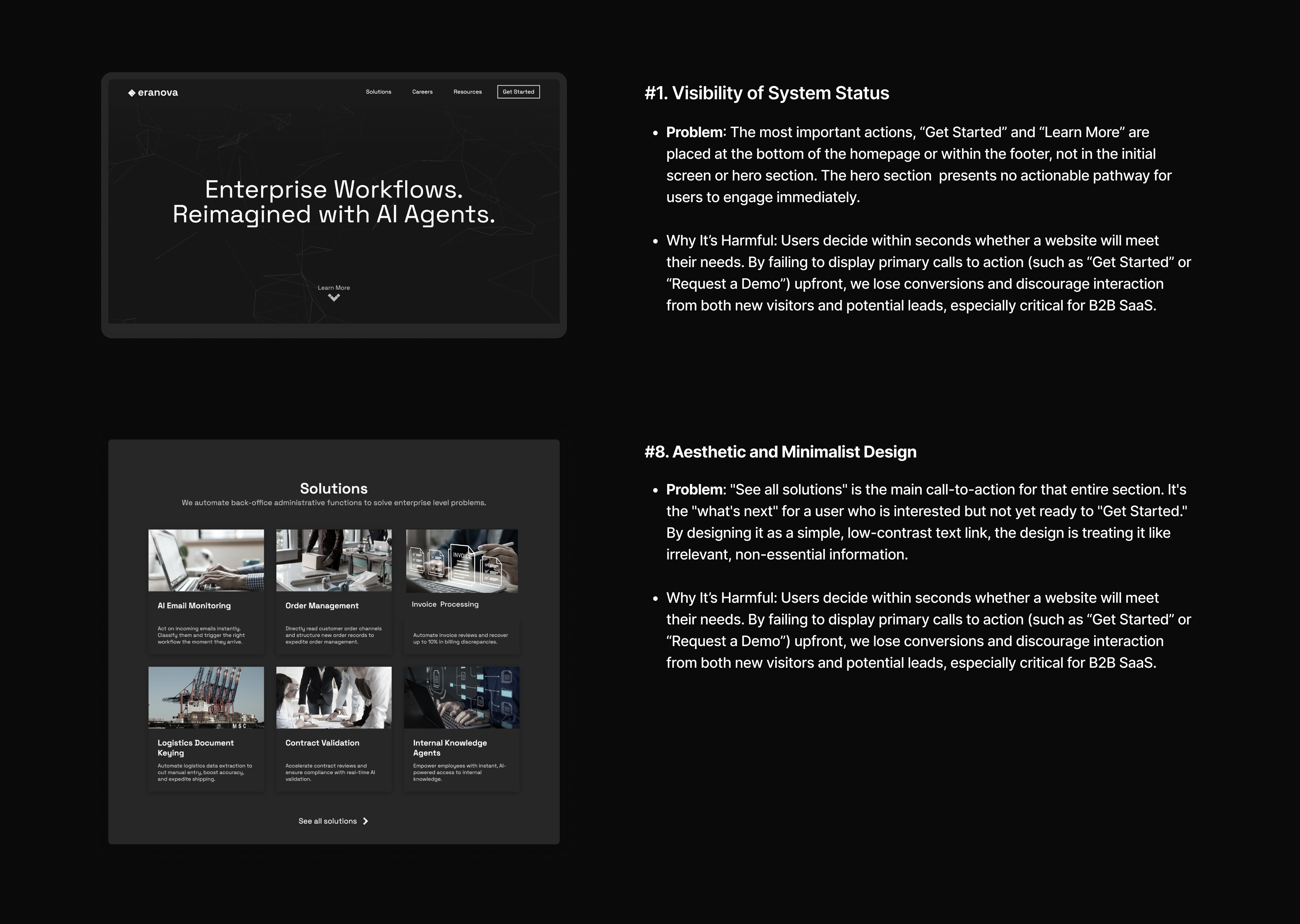
Nielsen's 10 Heuristics: CEO presentation deck, Month 01
- 1H1No CTA in the hero
- 2H4Broken theme across pages
- 3H8Weak CTA visual hierarchy
- 4H8Filler content burying the lead
- 5VLInconsistent icon & font styles
- 6BRNot enterprise-grade brand
No CTA in the hero
Primary actions "Get Started" and "Learn More" were buried at the bottom of the page. Enterprise visitors landed with no immediate next step. First impressions were wasted.
Broken theme across pages
The homepage was full dark-mode. Inner pages abruptly switched to light mode, only the navbar stayed dark. Jarring and unpolished, the digital equivalent of walking from a cinema into bright sunlight.
Filler content burying the lead
A full-screen section consumed nearly two scrolls to deliver one generic sentence. It pushed valuable content further down, significantly increasing the risk of abandonment.
Weak visual hierarchy on CTAs
"See all solutions", the key next action for the entire solutions section, was styled as a low-contrast text link. No prominence, no weight. Easy to miss entirely.
Inconsistent icon & font styles
Icon styles mixed freely across the interface. Font weights and sizes had no coherent system, making the site feel unfinished and untrustworthy to enterprise visitors making fast judgements.
Not enterprise-grade
The overall aesthetic failed to communicate the quality of the product behind it: grey tones, inconsistent spacing, no design system. The site didn't match the ambition of the business.
Three months.
Three distinct phases.
Each month had a clear focus. No overlapping, no jumping ahead.
The pitch before the pixels
If the brief reframe failed, no design work would matter. Validate the assumption first.
- Heuristic audit produced 8 documented violations
- CEO deck earned scope wider than the original brief
- No pixel work began until direction was set
System before screens
Every page and asset would inherit from this layer. Build it once, build it right.
- 16 design tokens defined as the foundation
- One master template across all solution pages
- Codex scaffolds, senior dev polishes, design held in Figma
The brief, answered last
Because the answer rests on the layers underneath it. Content can only scale on a system that exists.
- Brand library extracted from the token system
- LinkedIn framework A/B tested across 3 dimensions
- 50 posts shipped on the tested framework
From grey and white
to pure black and white.
The original site lived in an ambiguous grey zone, neither confident nor considered. The rebrand deliberately chose to strip everything back to black and white. The aesthetic draws from the language of AI itself, binary, precise, zero noise. Clean like code. Trustworthy like a system that works.
Every element either earns its place or disappears. That constraint became the design system.
Background
Surface
Muted
Sub
Accent
White


Figma first.
Codex to ship.
The redesign had an aggressive one-month build window. The workflow had to be tight. Every design decision happened in Figma first, layouts, components, spacing, content hierarchy. Only once the design was solid did development begin.
OpenAI's Codex translated the Figma specs into production code at speed. The initial prompts and creative direction were mine. As page complexity grew, especially across the solutions architecture, the senior developer joined to handle advanced implementation while I maintained design ownership throughout.
Key design decision: Rather than designing each solution page individually, I built one master template covering layout, component structure, spacing rules, and content hierarchy. That single template scaled across every product use case without redesigning from scratch each time.
Section designed in Figma, before any code.
50 posts.
All data-driven.
The LinkedIn work didn't start with the framework. It started with a problem the analytics couldn't see. Engagement looked flat. But the inquiries that came in told a deeper story.
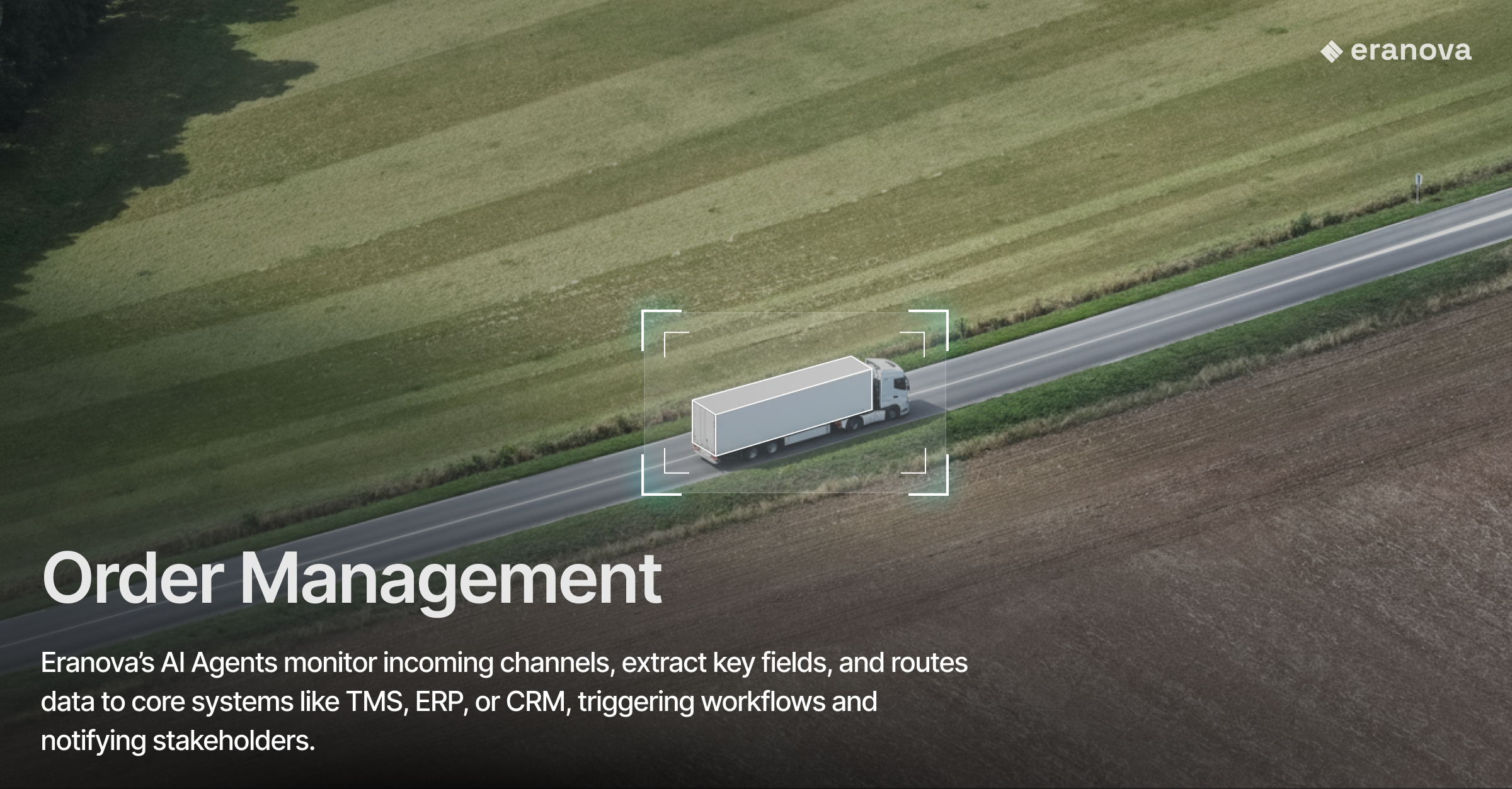
The visual that ran across most early posts was a freight truck with the Eranova logo placed on top of it. In the logistics industry, this signaled exactly the wrong thing. Inquiries started arriving from logistics buyers asking about Eranova's fleet, freight rates, capacity. None of which Eranova offered. Eranova built AI agents for the operations behind those trucks, not the trucks themselves.
Two things changed.
Buyers scrolling LinkedIn weren't pausing. The posts they saw were single images with a truck and a logo on top, no context, no offering, no reason to stop. The methodology and the format had to solve that human problem, not just a metrics problem.
01 · The methodologyI introduced weekly experiments, what the CEO came to call "science experiments." Friday through Sunday (LinkedIn's peak engagement window), one variable changed per cycle: tagline, eyebrow text, lead visual. Whatever performed best became locked. The next experiment varied the next variable. By the end of each cycle, the framework had compounded.
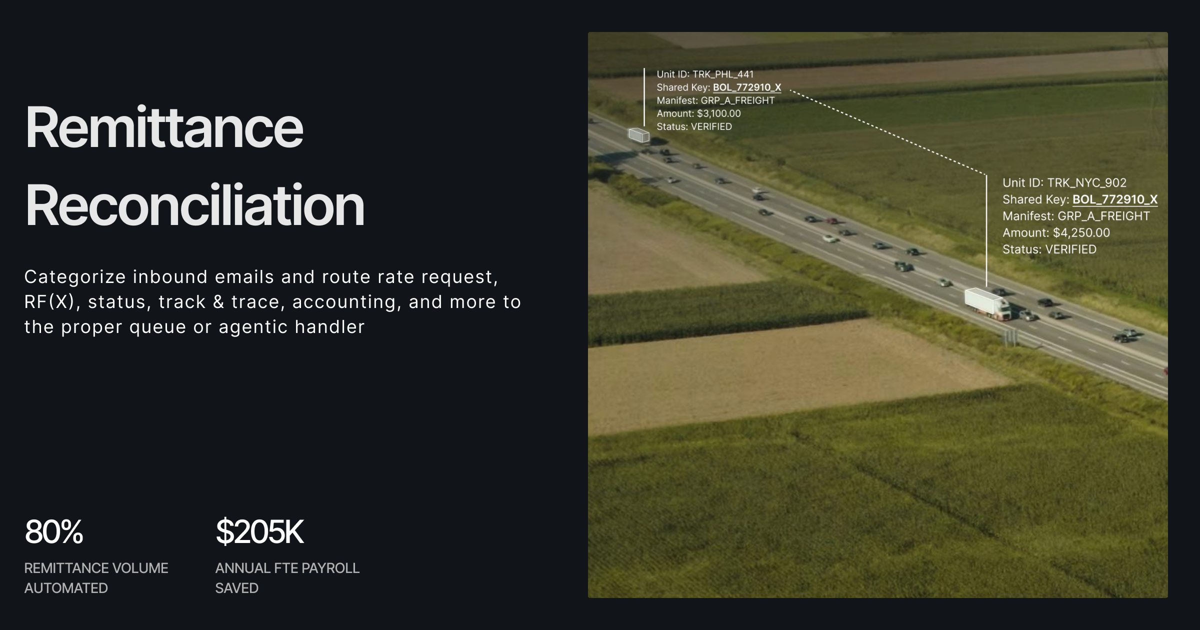
Static single-image posts couldn't carry enough context. A truck visual alone was getting misread. I moved the framework to carousels: multi-slide posts that could sequence "who we are → what we actually do → how we help." The truck stayed as the opening slide (it anchored the industry visually), but the slides that followed clarified the offering.
The inquiries shifted. CTOs and CEOs of logistics companies started reaching out asking how Eranova's AI could help their operations, the inquiries the team actually wanted. Inquiry volume mattered less than inquiry quality. And that's the metric that moved.
What follows is the production framework that emerged from the science experiments: three dimensions tested, three winners locked, 50 posts shipped on the framework that survived contact with real engagement data.


Tokens that scale
beyond the project.
One of the most lasting deliverables from this engagement wasn't visible on the website; it was the foundation underneath it. I built a full token-based design system in Figma, mapping variables for icons, surfaces, and borders, each with defined light and dark mode values. This gave Eranova's internal team a single source of truth they could apply consistently across the site, future product work, and any internal tooling, without needing to re-solve color decisions from scratch every time.
The system covered 16 mapped variables across three groups, Icon, Surface, and Border, all aliased to a foundation layer so updates cascade automatically. What started as a branding exercise became infrastructure.
Decision rationale: Considered scoping the tokens to color alone, since that was the most visible inconsistency on the original site. Expanded to include icons, surfaces, and borders so future product work and internal tooling wouldn't need to re-solve these decisions at every new page. The broader scope cost two extra days. It saved every page after.
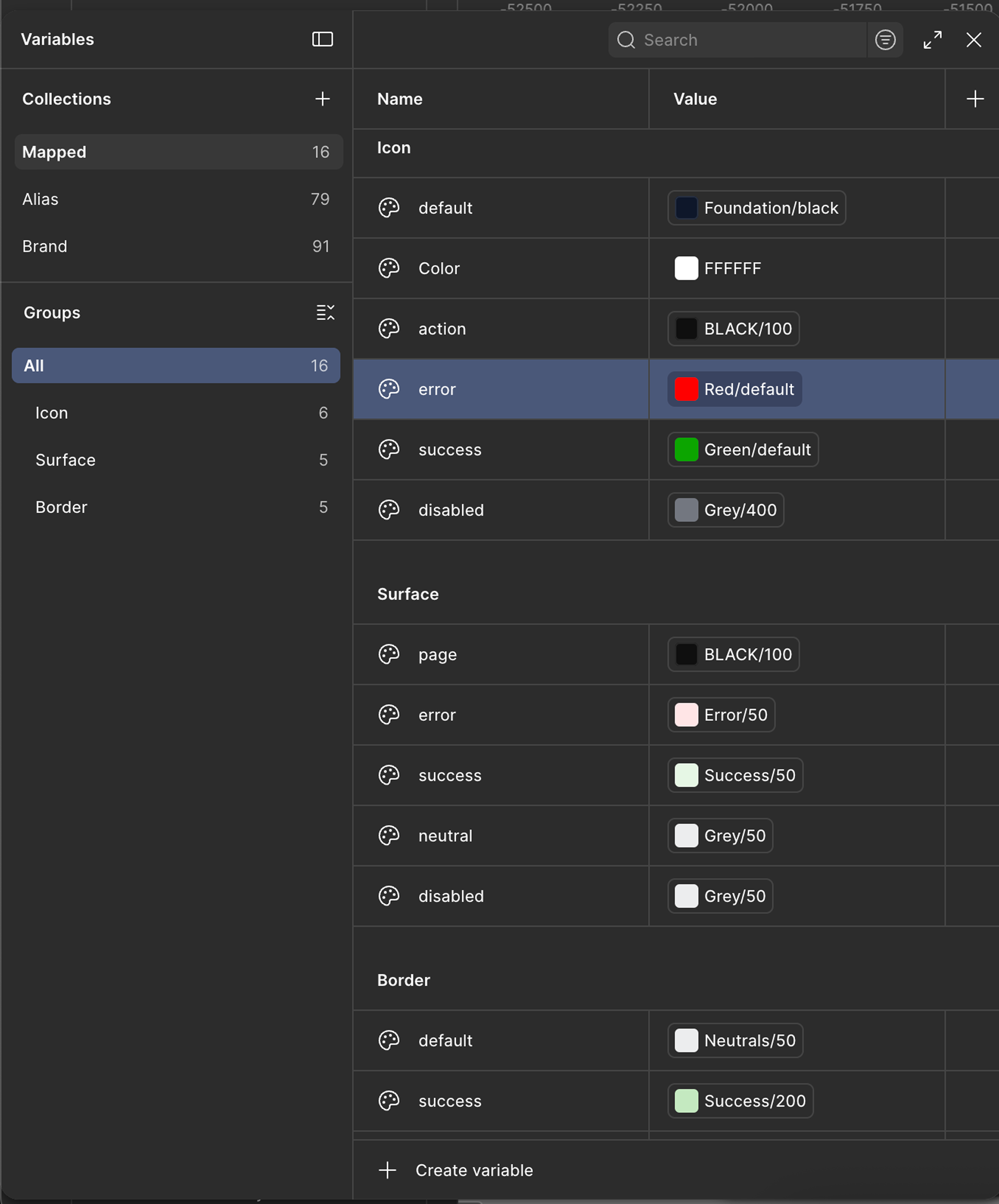
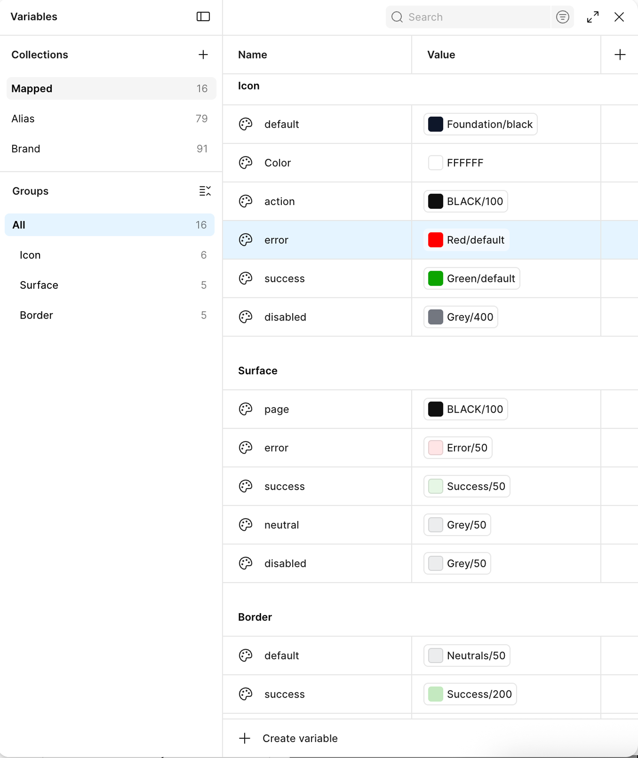
Figma Variables panel: Mapped collection, 16 tokens
How I Work.
- Prioritized alignment before pixels: ran the heuristic audit and presented to the CEO before committing to any UI direction → the redesign felt inevitable to the client, not subjective. A rebrand without evidence behind it can be argued against. One with 8 documented failures can't.
- Built one master template over designing each solution page individually → eliminated redundant layout decisions and gave the developer a single source of truth. The alternative would have produced inconsistencies at every page boundary.
- Translated a marketing-channel brief (traffic, conversion) into a system-level engagement by testing the brief's hypothesis first. The heuristic audit surfaced root causes, not just symptoms, and gave the redesign evidence-backed scope before any pixel work began.
- Compressed the LinkedIn content strategy question, what format, what tone, what cadence, into a structured A/B test. Every production decision was evidence-based before committing to scale. 50 posts from one tested framework, not 50 experiments.
- The brief named a symptom (low marketing conversion) without naming a cause. I defined the real goal as "rebuild the system the symptom is sitting on, so the surface stops decaying" and used that definition to scope every decision downstream. Without a specific definition of success, any design can be argued to work.
- It wasn't clear what success looked like for the LinkedIn work. I defined it as content system adoption by the internal team, not post volume alone, which is why the deliverable was a brand asset library alongside the 50 posts. Volume without a system just creates maintenance debt.
- Built Figma tokens aliased to a foundation layer so updates cascade automatically across every component. The upstream investment in the token architecture meant downstream changes to the palette would never require a manual page-by-page update.
- Kept design ownership throughout while the senior developer handled advanced implementation. Figma as single source of truth for both roles meant design intent survived the handoff intact. Decisions made in Figma were honored in production, not reinterpreted.
Shifted from designing screens
to building design arguments.
What opened as a marketing question became a systems engagement once the audit surfaced the cause underneath the symptoms. The work taught me that the brief is a starting point, not a specification.
The audit-before-pixels discipline is now how I start every engagement where the direction isn't already fixed. Leading with evidence changed how stakeholders respond to design decisions. A design with documented rationale behind it is a different kind of artifact than one without it.