The brief said:
tame a fleet.
Designing an enterprise fleet management platform that turns dense operational data into fast, clear decisions — across mobile and web.
A fleet management platform
built for scale.
TATA Fleet Edge is an enterprise platform enabling businesses to monitor vehicles in real time, track health and violations, schedule maintenance, and surface driver behaviour insights across large fleets.
Working exclusively on the TATA brand at ZenFishive Labs, I spanned multiple modules across mobile and web — designing interfaces that transform dense operational data into clear, fast decisions.
Fleet managers need to scan the status of 100+ vehicles instantly and act on critical alerts in seconds — without being overwhelmed by the data they don't immediately need.
Five goals that shaped
every decision.
Before any wireframe, I defined what success looked like.
Thinking on paper before
touching Figma.
Four phases. No skipping steps.
The insight that changed
everything.
One stakeholder session reframed the entire design direction.
"When everything is urgent, nothing is urgent. I stop reading the alerts after the first ten minutes of my shift."
Every design decision after that moment was filtered through one question: does this make the important thing faster to find?
Exploring directions before
touching Figma.
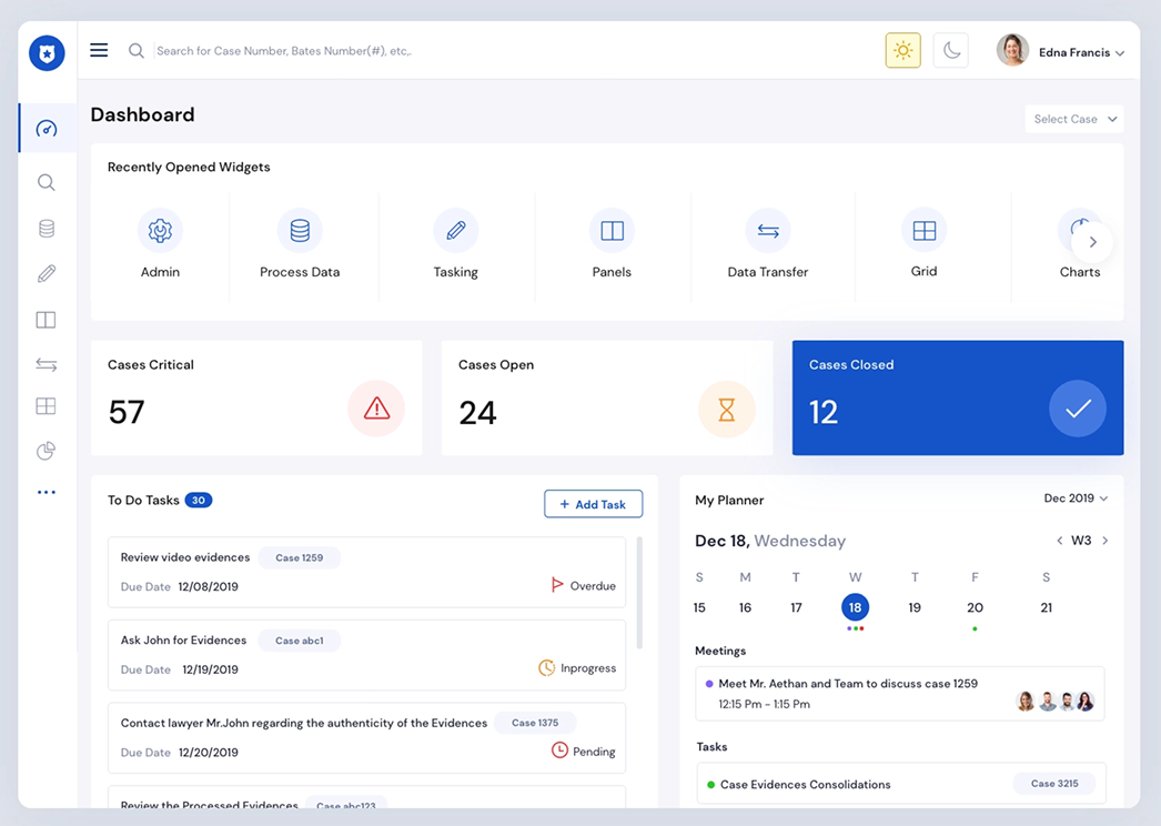
I explored reference interfaces and competitive fleet platforms to understand B2B dashboard conventions — then deliberately challenged the patterns that didn't serve real fleet manager workflows.
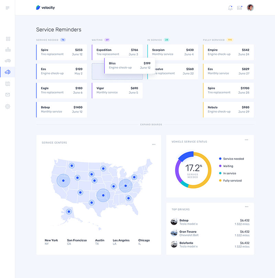 Dashboard layout
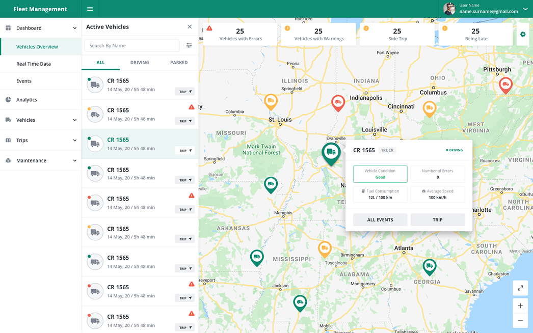 Map interface
 Data tables
 Mobile patterns
Building the
system first.
Before designing screens, I built the component library. Every new module took days instead of weeks.
Three decisions that
shaped the product.
Not everything is worth explaining. These three defined the platform.
What the work
achieved.
Six months of solo design work across mobile and web. Four core platform modules designed end-to-end.
What broke.
What I learned.
The lessons that will follow me into every enterprise project.